2005.03.14
A Plea for Usability Design in Children's Electronic Toys
I am not particularly fond of children's electronic toys, but they constantly arrive at home as presents, and they also attract the children's attention. Unfortunately, the usability aspects of most electronic toys for toddlers and children appear to be ignoring important and well-established principles of user interface design.
Gratuitous Functionality
 Imagine yourself entering your car in the morning and turning on the
ignition. The car honks, its windshield wipers start sweeping, every
light bulb on the car sequentially turns on and then off, the doors lock,
the windows open, and then close again.
This one-minute sequence repeats itself every time you start the car.
Although such a car would be the
laughing stock of the neighborhood, similar toys are sold every day in
shops around the world.
The designers of most children toys consider
it their duty to run a full demo of the toy's capabilities every time the
toy is turned on.
Of course, all this eye and ear candy gives the game
totally away.
The toddler does not need to do anything interesting in
order to listen to the music or see the flashing lights.
All that is needed is to turn the game off, and then on again.
Other toys, provide
pre-canned functionality whose only purpose appears to be to dissuade
the child from trying. Many musical keyboards contain, so-called
"rehearsal songs". These play canned tunes like "Jingle bells" and "Oh
Susanna", demonstrating the instrument's awesome musical capabilities.
However, children faced with the choice between pressing a button to
have the piano play "Jingle bells", and trying to compose their own
tune on the keyboard, will sadly opt for "Jingle bells" —
again and again.
Lack of Reactance
Just because they are children, does not mean they are stupid. Or slow. Many children toys, (under)powered by what are apparently 8-bit microprocessors that were deemed incapable of running a microwave oven, stubbornly refuse to respond to key presses while they are doing their previous bit (playing music, saying a word, flashing the lights, whatever). Preemptive polling and interrupt-driven processing are probably considered too advanced software features to include in a child's toy. The end result is that the toy's behavior appears capricious and unpredictable to the child. Often, pressing a button makes it say a sound, but at other times, pressing the same button does not have any effect. Maybe the hidden agenda of the toy manufacturers is to condition children to consider software bugs to be normal features.Interfaces with Hidden State
 Complicating the above problem even more, some toy designers,
in order to cram
the maximum possible functionality with minimum possible moving parts,
have their toys switch between a number of different states,
radically altering their behavior in each state.
Thus the same button is used to play different tunes or make animal
sounds;
or have the toy spell numbers, or letters, or colors.
Programming this schizophrenic behavior into the toy ensures that none of the
valuable bits available in their microprocessor's ROM will get wasted.
Sometimes, a separate switch alters the state, at other times the state
switch is just random.
The end-result is the same:
the children have great difficulty seeing and learning
the principles of cause and effect:
the same button plays one tune now,
and another tune the next time they press it.
But, I'm sure they'll become expert users of the vi editor.
Disregard for IT Standards
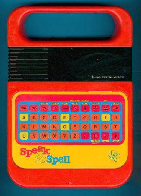
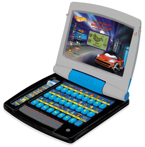
 Starting with the 1980's Texas Instruments Speak and Spell games,
and continuing today
with some of the baby laptops, toy designers seem to believe that
children are somehow born knowing the order of the alphabet letters,
and would therefore vastly prefer a keyboard whose keys are ordered
alphabetically, rather than one in the typical QWERTY order.
Then, when the child has grown up, it can easily relearn to type
on a QWERTY keyboard.
Only of course, the child has never learned to type, because all these
non-QWERTY keyboards have their unique non-standard key arrangements.
 Maybe the objective of the alphabetic keyboard design is to have the
children learn the order of the letters in the alphabet.
However, this can be easily accomplished by another of those
"learning activities" available on these games.
There is really no need to confuse children with idiotic keyboard
designs at this age, they will have plenty of opportunities to swear
at misplaced Ctrl keys when they grow up.
Read and post comments


