Poster Counterexamples
The following are some counterexamples of the poster design techniques I described. To protect the guilty, you can not click on the images for a larger version.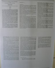
The paper's pages printed on an A0 sheet
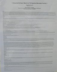
The paper typeset and printed on an A0 sheet; this is worse the previous example, because our eye can't follow printed lines spanning half a metre.
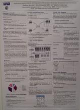
Too much and small text, not enough color (EURO XX 2004)
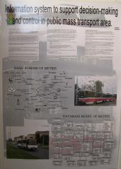
Too much information (text and small diagrams), glossy paper (EURO XX 2004)
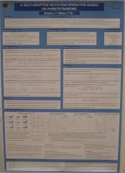
Too much and small text (EURO XX 2004)